Category Archives: Part 2 – Elements of Design

Elements of Design; Project – Shapes; Exercise 21 Real and Implied Triangles

Triangles, real and implied, are the focus of Exercise 21 of the OCA’s Art of Photography Elements of Design module.  Michael Freeman in Art of Photography, a core text for the programme, notes the usefulness of triangles in composition because they are simple to construct or imply.  Additionally, if they have a level base they aid the stability of the composition.  The formation of triangles may be on the basis of reality or by implication.  In the case of implied triangles the implication arises because of the juxtaposition or positioning of three points.

This exercise calls for the making of images of real triangles (one by perspective, one inverted by perspective and one of faces) and three still life triangles; normal, inverted and made up of three faces.

The first three images below are, in order, a real triangle, normal by perspective and inverted by perspective.  The making of these images required a significant step outside my image making comfort zone as I would not normally spend time making images in urban settings.  The final image of these three took some time to figure out how to make it work and, notwithstanding the feedback from Assignment One in which a key reflection was the need to consider why rather than how an image was being made, the making of this image gave considerable technical satisfaction.

Real Triangle

Triangle Perspective 1Triangle Perspective 2

The following three images are concerned, in turn, with a normal, still life triangle, an inverted, still life triangle and a triangle made of three faces.  My image making has not included still life and the generation of ideas for still life images has proven to be very challenging.  In the first few attempts I defaulted to secure areas such as geology and scuba diving.  However, these prove to be unrewarding and the images below represent first attempts to step outside of comfort zones.  The first two images speak for themselves.  In respect of the third I was attempting to create the mood of a photograph in a locket by capturing the family group by reflection in an oval mirror.
TriangleInverted TriangleFaces Triangle

Elements of Design; Project – Rhythm and pattern; Exercise 22 Rhythms and Patterns

The final exercise in the OCA’s Art of Photography module on Elements of Design has been the least satisfying for me as I struggled first, to find optical rhythms and patterns at all, and second, ones that were not boring.  This I think was a reflection of the fact that, in contrast to points and lines, which are frequent occurrences in my images, patterns and rhythms are rare to the point of absence.  For that reason alone completing the exercise has been worthwhile.

I offer the following two images in the realisation that I am not at all fully satisfied with them as images other than they have helped me to understand these two elements of design.

The requirement for the exercise is to produce two images with one showing rhythm and the other pattern.  In the image with rhythm there should be a sequence in the picture so that the eye will follow a direction and a beat (p97 of the OCA notes) and in the pattern the main point is to ensure the pattern is accurately framed.

Both images are from Amsterdam.  The first shows rhythm with four double windows separated from each other by intricate stone work.

Rhythm 1

The second image is of a steel framed window in which the pattern is very exact and framed accordingly. In an attempt to introduce some interest I have ensured that the refection in the underlying window is somewhat visible.

Pattern 1

The trouble I have with these images is that whilst the elements of design are very clear and unless there is some interest other than the pattern or rhythm itself then, for me, the images become boring.   Scarlatt Hooft Graaflland’s image of three green corrugated iron pitched roofs draws on rhythm to form the basic structure but the visual interest is heightened dramatically with the naked body lying over the centre roof.

Elements of Design; Project – Using Lines in Composition; Exercise 20 Implied Lines

Up to this point the exercises in the Art of Photography’s ‘Elements of Design’ modle have been about lines that can be seen to exist.  This exercise (20) is concerned with lines that are implied.   Michael Freeman in The Art of Photography, a core text for the programme draws particular attention to lines that are implied, specifically eyelines, and the role they play in composition.  He notes (p.82) that human faces are so important  that if a face appears in a photograph and is looking at something then then we are automatically drawn to what the face is  looking at.  If the object of the gaze is in the photograph (or is made so through composition) then the matter is resolved but if the object of the gaze outside the image then it is unresolved – a tension that the photographer might want to create.

The first images below are from the course notes for the programme and the exercise involves drawing the implied lines from the images.  The two pictures have been scanned as jpegs and then implied lines drawn in using Elements.  The first image of the bullfighter suggests a close line between the matador and the body of the bull while the sight line of the bull towards the right of the image is implied.  In the second image the two horses have strong sight lines towards the bottom right hand corner while the horseman is looking towards the horses themselves.

Implied Lines

In the remaining images I have used two underwater images and one out of water.   In each case the original image is shown and then this followed with the image showing the sight line that was part of my intended composition.

The first image is of a cat in a garden sitting quietly but warily and gazing towards the bottom left hand corner.  The tension is unresolved as the object of the gaze is not within the frame.

Cat in Garden

Cat in Garden - Implied Line

In the second image a diver in the top left hand corner is looking towards a large crab in te bottom right hand corner.  The torch pointing towards the crab also helps to confirm the implied sightline.  Although this is a fairly classic underwater composition it is not easy to achieve as it requires strobe exposure of the dark area of the frame to light the crab with a slow (1/30) exposure to expose the diver and get the green of the water in the background.  In this image the crab is only about 50cms from the lens; an ultra wide angle  (10-15mm) lens is normally required for this shot.  Making this image gives me significant technical satisfaction while the implied interaction between the diver and crab implies some form of link.
The Gullies October 2013

Diver and Crab - Implied LineThe third image is somewhat similar to the second in that it is an underwater image.  However, in this case the implied line is between the catshark to the left of the image and the divers torch in the top centre of the image.  This was the composition I was trying to make and the technical requirements were very similar to those in the second image so resolving the composition in this image gave me significant technical satisfaction.

Dog fishDog fish - implied line

Elsewhere I have reflected on the feedback from Assignment One part of which was to try and start to consider why rather than how I am making images and from there move to a deeper understanding of my emotional response to and involvement in an image.  These three images help me to start to piece together that understanding – a sense of engagement and involvement that borders on intimacy.  Further, when I look at an image like Steve McCurry’s showing a sick child being observed by an adult (a parent) I am starting to get an inkling of what generates an emotional response for me in an image.  In this instance it is a sense of intimacy in the image.  


Elements of Design; Project – Lines; Exercise 19 Curves

Curves are qualitatively different from vertical, horizontal or diagonal lines as they represent a progressive change in direction.  However, according to Michael Freeman in The Photographer’s Eye, a core text for the Art of Photography programme in the OCA they do interact with straight lines in an image because they themselves are essentially a series of straight lines.  Nowhere is this more obvious than at the ends of the curves where they imply a straight line direction away from the end of the curve.  Curves have additional qualities that lines lack, in particular rhythm and a sense of movement.

This exercise (19) from the OCA’s Art of Photography Elements of Design module requires four images that each exhibit curves as part of the design of the image.  Each of the four images below is accompanied by a short commentary that explains howI developed the image using then curves evident in the image.

The first image is an underwater image of a Lemon Sole.  The body of the fish shows the curve strongly.  I attempted to use the curve to draw the eye of the viewer to the eye of the fish in the top left hand corner.

Common Sole (Solea solea), Richard Thorn 2011

The second image is looking upwards in the Roman amphitheatre in Arles in France.  I was taken with the strong curvature in the ceiling and tried to draw the eye of the viewer from the bottom left hand corner of the image to the top using the curve.

Les Arenas 2

This third image, titled ‘Moon over Slieve Mor’, was taken early in the morning with little colour evident.  I have tried to use the curve to draw the eye of the viewer from right to left to the moon peeking out over the shoulder of the hill.

moon over Slieve Mor

The final image showing a curve as the main element of design is of a rainbow drawing the eye towards a metal sculpture.  This image was constructed deliberately to have the rainbow intersecting the warrior.

Rainbow Warrior

Bruce Barnabaum uses curves as strong design elements in his slit canyon and Wells Cathedral images.  Barnabaum, who started life as an engineer, explains in The Art of Photography, Rocky Nook. 1994 that the curves in his slit canyon images have a very strong mathematical grounding and that it is this link to the world of science and physics that is one of the attractions for him of the slit canyons.  There is no doubting the dynamic nature of the slit canyon images.  Although both the slit canyon and the Wells Cathedral images are inanimate the scale is such that I can relate to the images. I come back to the issue of an emotional response to images in my reflection on Assignment One.

Elements of Design; Project – Lines; Exercise 18 Diagonals

Vertical and horizontal lines, as noted in another blog, tie very closely to the edges of the frame and any misalignment is quickly noticed by the viewer.  Diagonals, as Michael Freeman in The Photographer’s Eye, a core text for the OCA’s Art of Photography course, free the need for alignment with the frame.  Additionally, diagonals introduce much greater dynamism into an image.  According to Freeman, diagonals represent ‘unresolved tension’.  This learning log is concerned with the use of diagonals as elements of design in images.

Four images are presented below each of which uses diagonals as a key component in the design of the image.

The first image is of naturally occurring diagonals formed by the way in which the limestone rock breaks up.

_DSC3380

The second image is of an abandoned industrial building and the diagonals were captured by using a wide angle lens up close and looking upward to the building.

_DSC3411

The third image shows diagonals (emphasised by the line overlays) of naturally formed sand and pebble on a beach.

Beach Diagonals

The fina image is of diagonals formed by shooting beneath a seaside pier.

Lanzarote

Unlike horizontals and verticals I would not have consciously sought to include diagonals in my images to date as evidenced by the fact that I have few of them in my image library.  I suspect that many of my images that use lines as elements of design are thus somewhat static and lack dynamism.

Dave McKane is a Dublin based photographer who comes from a graphic design background.  His main imaging work is around abandoned and derelict man made objects and large buildings.  All his work makes strong use of diagonals to give depth and energy. Here an abandoned car displays strong diagonals as part of the image design.

Elements of Design; Project – Lines; Exercise 17 Horizontal and Vertical Lines

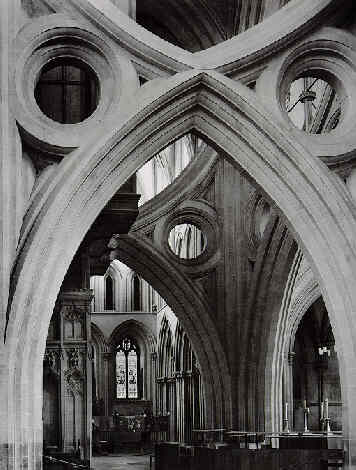
Just as with points in exercises 15 and 16, lines, as elements in design in my images, have featured regularly.  See the image below from the new science museums in Valencia and Spain.  I am certain that I have been attracted to the formality of the architecture and the roles that lines play.  Equally I am certain that I have not consciously been aware of the exact role that lines play.

Valencia

This exercise (17) and the subsequent ones on diagonals and curves in the OCA’s Art of Photography course is concerned with identifying lines as elements of design in images and then specifically identifying them in images.  The emphasis is on the lines themselves rather than the subject matter.  Making the distinction between the lines and the subject was challenging.

The first four images are concerned with horizontal lines.  As the notes for the course (pages 74-77) note horizontal lines provide stability and weight whilst being static.   Each of the images has a short commentary on the role that the horizontal lines play in the image.

The first image is of cloud over a mountain in the west of Ireland.  The horizontal lines divide the image into three zones; the foreground bog, the mountain and the cloud.

Slieve-Mor-1

The second image is a digital scan of a slide from the 1980’s.  This is a Buddhist temple from the Guiyang province in China and the image is divided into three components by the horizontal lines; the foreground is the garden, the middle is the body of the temple and the roof comprises the third part of the image.

Buddhist-Monastery,-Guiyang copy

The third image is a beach and sea scene with the image being divided into three by horizontal lines; the sand, the stony foreshore and the sea itself.

_DSC3377

The final image in the sequence is of cloud and sky taken on a recent flight.  Although the image is relatively simple I feel that by placing the cloud, with all its textured and muted colours as the bottom 75% of the image and the sky as making up only 25% the right balance is struck between coud forming the base and sky the area above the horizon.  The image was shot in RAW and worked in Elements to extract detail from the cloud.

Into the Great Wide Open

The use of horizontal lines as elements of design is often found in landscape images where the strucured division into land and sky is realised through the placement of horizontal lines.  Ansel Adams’ ‘Mount Williamson, Sierra Nevada, From Manzanar, California‘ is one such example.  This image is clearly divided into stony foreground, mountain in middle distance and sky in the far distance by horizontal line placement.

In contrast to horizontal lines vertical lines have a greater sense of movement and are more challenging to the viewer.  The four images below have strong vertical dimensions and, as with the previous clutch of images, each is accompanied by a short commentary.

The first image is taken through a slit opening in the Pope’s Palace in Avignon and, in turn, captures vertical features of the building through the slit.

_DSC2183

The second image is a macro, hence the shallow depth of field, of the internal structure of a fossil coral.  The coral, when alive would have been standing vertically and the plates, seen here as verticals, would have been horizontal growth plates.

Corals

The third image, is again a macro, but this time of the plant Astilbe – at this stage in its growth only about 5 to 6 cms high; I was trying to capture a woodland effect in miniature.  The vertical elements are the red plant stems.

astilbe

The last image is the strongly vertical structure of a disused industrial building’s lift shaft.   Not as pretty as the third image but nonetheless displaying the vertical elements very strongly.

_DSC3410
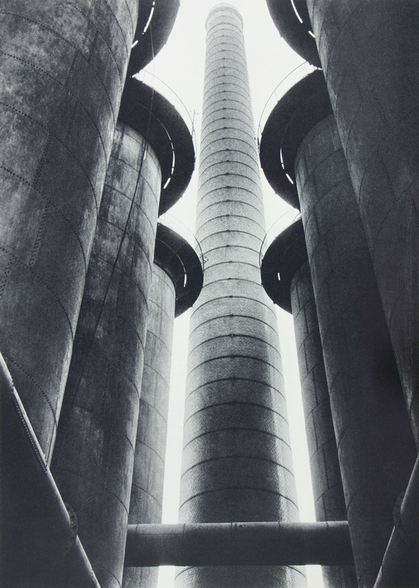
The use of vertical lines as elements of design and to help frame the image is very frequent, particularly in archictectural or urban photography and landscape photography where forests are the subject.  The images by Albert Renger-Patzsch of industrial forms and smokestacks from 1927 and the alley in Thomas Annan’s ‘Close, No 61 Saltmarket’ demonstrate the use of verticals.  In the case of Annan’s image the vertical element is heghtened as one is drawn through the image to the dark entrance at the end of the alley.

A critical feature of horizontal and vertical lines is the relationship they have to the edge of the frame.  The eye will very quickly detect if there is misalignment and the lines are not perfectly horizontal or vertical.  Interestingly Paul Strand used misalignment deliberately in some of his images of buildings.  The ‘Church on the Hill, Vermont’ from 1946 is a good example of this.  While the image is framed by exactly by two trees the verticals of the church are misaligned with the frame edge.

Bearing in mind the feedback and reflection from Assignment One the images by Renger-Patzsch and Saltman, while meeting the technical requirements of the use of vertical lines leave me cold.  In contrast, Strand’s image evokes a slightly warmer response.

Elements of Design; Project – Points; Exercise 16 Multiple Points

Here I make confession.  Until undertaking this exercise I had never tried still life photography.  Whilst I had, in the days of film, often taken slides of maps, diagrams etc for use in lectures, I had never attempted to do something artistic through the means of still life.

The exercise which is the subject of this blog is concerned with imaging a group of individual points that together imply a set of lines.  The exercise is Exercise 16 in the OCA’s Elements of Design module in the Art of Photography course.  In the sequence of images below Smarties (they were very difficult to find) have been placed on a black and white photocopy of a newspaper insert advertising sweets.  I have overmarked each image in Elements to show how the points can be grouped and the final image is unmarked to show the finished product.  Image 1 Image 2 Image 3 Image 4 Image 5 Image 6 Image 7 Image 8
Image 10I am not sure if Roger Fenton in his image ‘The Valley of the Shadow of Death, Crimea, 1855’ aimed for a specific placement of the cannonballs (as he was alleged to have done by Mary Warner Marien in the 3rd Edition of Photography – A Cultural History, 2010 – if he did it surely becomes a still life) but the image, nonetheless, relies on multiple points, the cannon balls, to achieve its effect.

Having undertaken the exercise and having looked forward to other activities in the Art of Photography course I realise that one of the biggest challenges is going to be developing an approach and confidence in undertaking still life exercises.

Elements of Design; Project – Points; Exercise 15 Positioning a Point

This blog is concerned with the OCA’s Art of Photography Elements of Design section and specifically with single points and their placement in an image.

When I look back over my own images I find quite a number in which I have placed a point, usually larger rather than smaller, within the frame.  The image of the diver in a freshwater quarry below is a good example of what I am talking about.All Alone

Have I really considered the placement of the point? Probably not. Other examples of my images that exhibit this design quality would include placement of individual shells, fossils and plants on walls.  Has the placement of these ‘points’ been consciously done to ensure that the image is not static – probably not.   I have usually been content to apply the ‘rule of thirds’ in the expectation that this satisfies the design requirements. This exercise and all of the ones following this have challenged me to consider far more deeply than I would have expected lines, points, shapes etc as elements of design.

The exercise requires reflection on images and situations in which points have been placed (see above) and experimentation with point placement in  three images.  These three images are shown below.  The context is quite clear – a plant growing from cracks in a rock.

_DSC3396_DSC3398 _DSC3397

The first is a standard, centre placement image that has the questionable virtue of being balanced if not very dynamic.  The second is offset to try and generate some dynamism to the image.  However, the placement here is not satisfying as, in addition to the plant, there are the cracks in the rock to consider. If the cracks are brought into consideration then all the action is taking place in the top left hand corner.  Hence my preferred placement towards the right hand side; the eyes naturally move from left to right and the cracks within which the plant is situated also run bottom left to top right.

As I was reflecting on this exercise I remembered an image I captured some time ago of a bright yellow lifeguard chair on a clean, sandy beach.  I remember thinking that here was something worth working with but having captured it and one or two very similar to it I was left vaguely dissatisfied.  I now know why; the placement was not logical.  The seat naturally ‘looks’ out to the top right hand corner of the image – there is an implied line (I will come to this in a later blog) and I did not realise this implied line effectively.  The image following is a heavily cropped image showing what I should have done – placed the lifeguard chair to the bottom left hand corner.Lifeguard Hut

Lifeguard 2A good example of how the placement of points is done effectively is Beaumont Newhall’s ‘Ansel Adams in the South West, 1947’ that is one of the frontispiece images of Ansel Adams – 400 Photographs. Published by Little Brown.  In this image Adams – the ‘point’ – is shown on the left hand side of the image which is a plain desert floor and bleached sky but walking towards the right hand side.

A very subtle example is Steve McCurry’s  Yemen image in his September 2013 WordPress Blog in which two very tiny figures are seen at the bottom centre of the image, almost by chance, after the eye has taken in the urban buildings rising up along a hill that engages the viewer at first.  Despite the small size of the figures there is a real ah ha! moment when they are spotted.  Also, despite the small size of the figures in relation to the scale of the rest of image the placement and context demonstrate an intimacy to the image that is very striking.